One Strong Voice
Visualising a coaltion’s core ethos: that together we are stronger. An adaptive brand identity that pulls on themes of amplification and cooperation.
Client: One Strong Voice
Project Type: Branding; logo design; art direction; social media design
-
One Strong Voice is the UK’s first coalition of campaigners with lived experience of the immigration and asylum systems. They have a vision: that those same systems can be non-discriminatory and treat people with humanity, dignity and fairness – the opposite of how they’re treated today.
The Nationality and Borders Bill, read in Parliament in July 2021, makes it extremely difficult for asylum seekers, refugees and other immigrants to seek help or relocate to the UK. It creates a hostile system that effectively criminalises those who need aid, sending them back to their previous destination or even their country of origin where they could be at serious risk. In response, One Strong Voice have developed an alternative agenda for a friendlier, more welcoming Britain that proposes that the UK not only meets its international responsibilities but also seeks to positively change public perception of those with lived experience of the asylum and immigration systems.
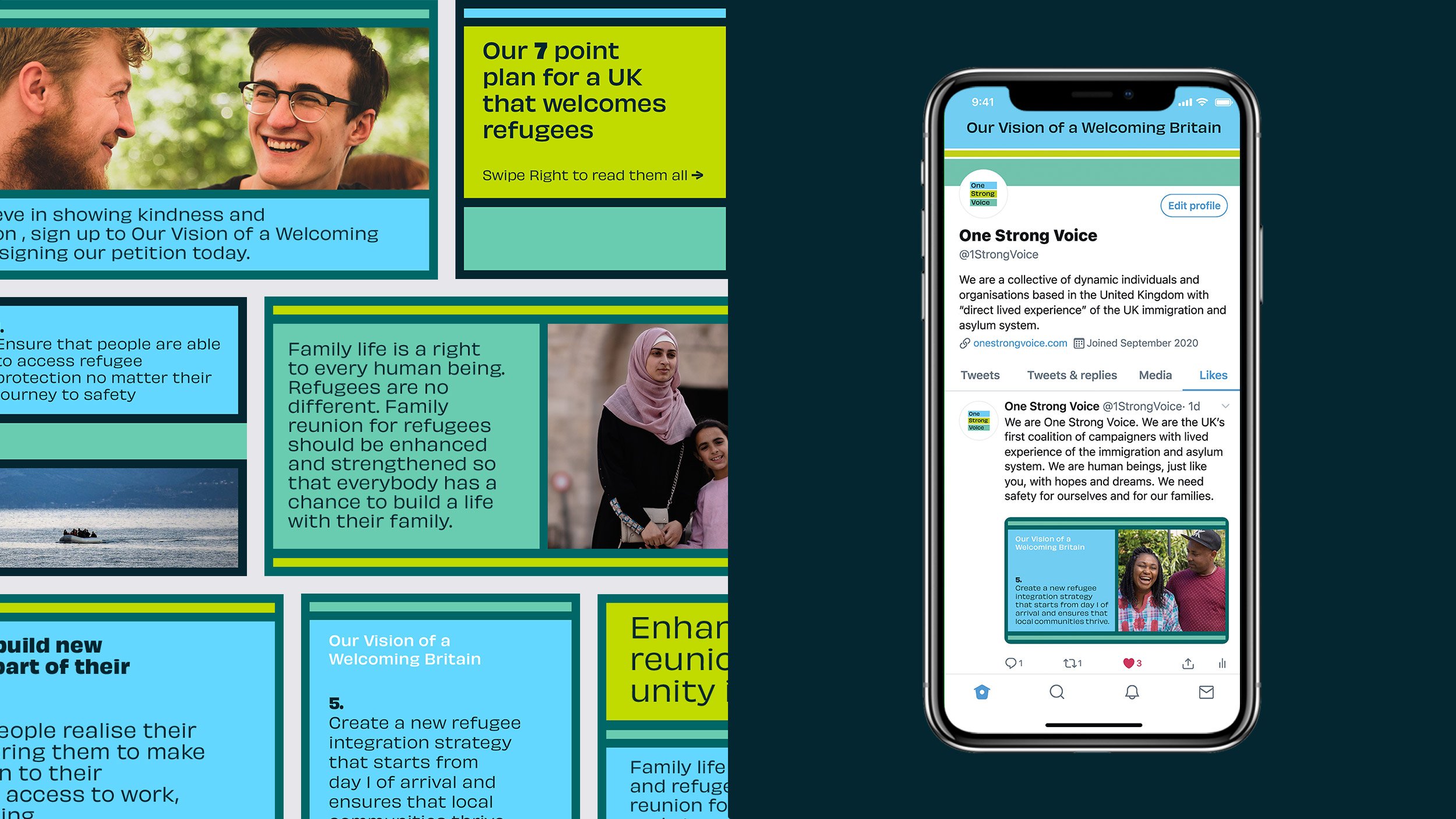
We worked with the organisation to develop a visual identity, website and a set of social media templates for use in their campaign, featuring designs influenced by One Strong Voice’s central theme – that the more voices there are, the more can be achieved – interpreted here as many parts coming together to form a whole.
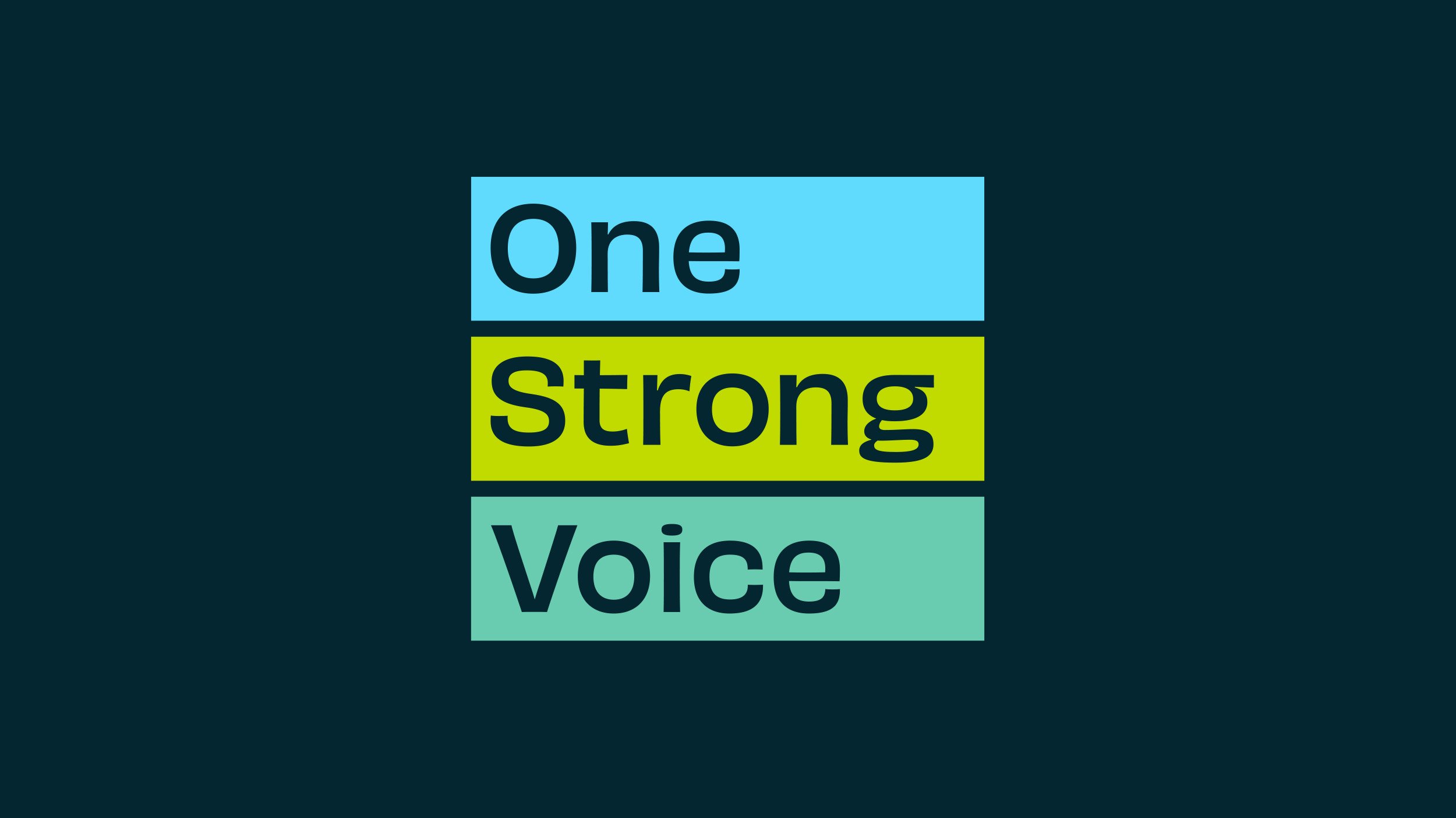
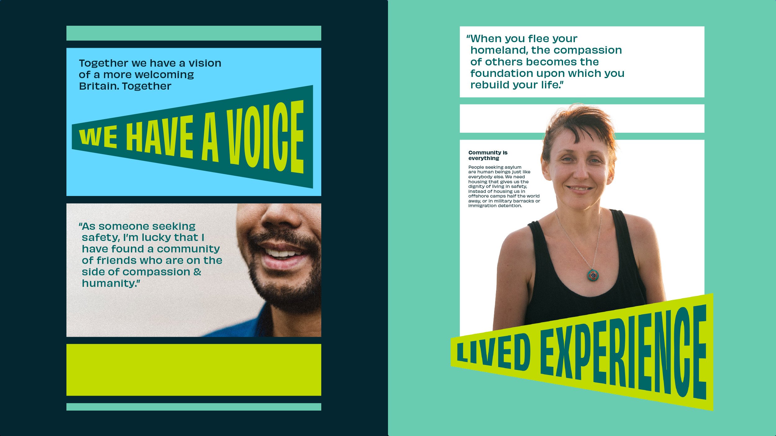
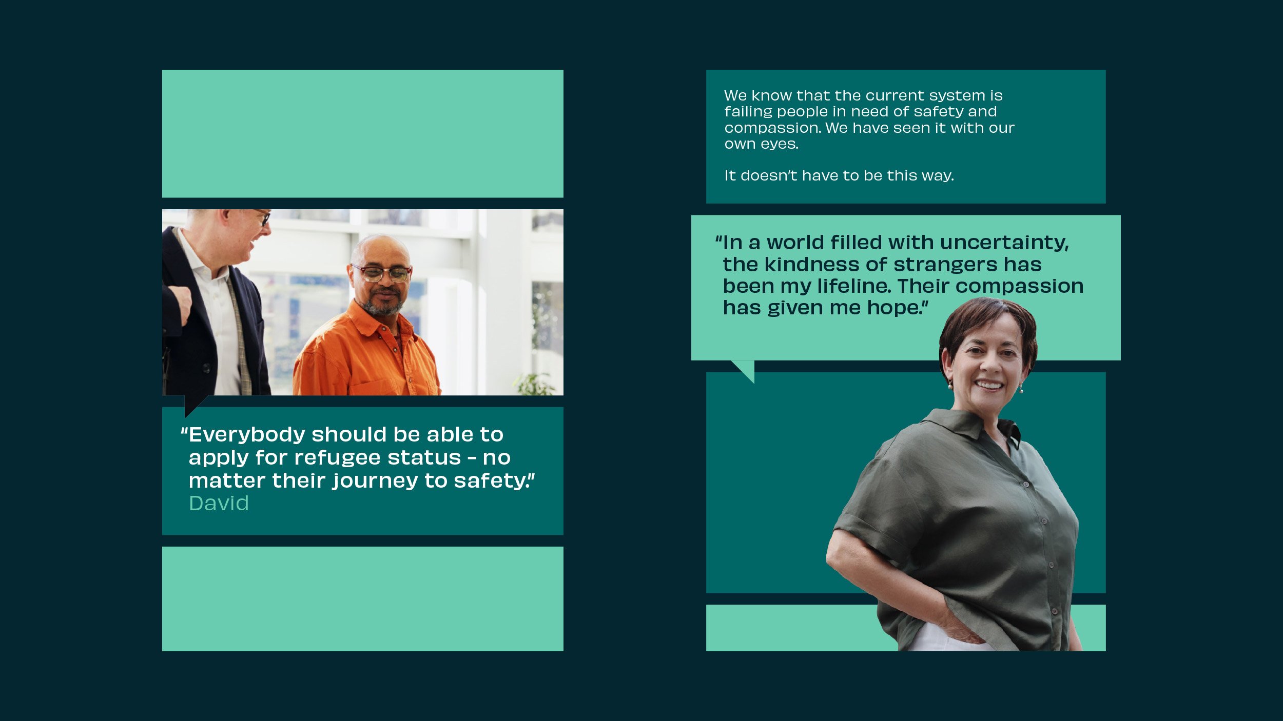
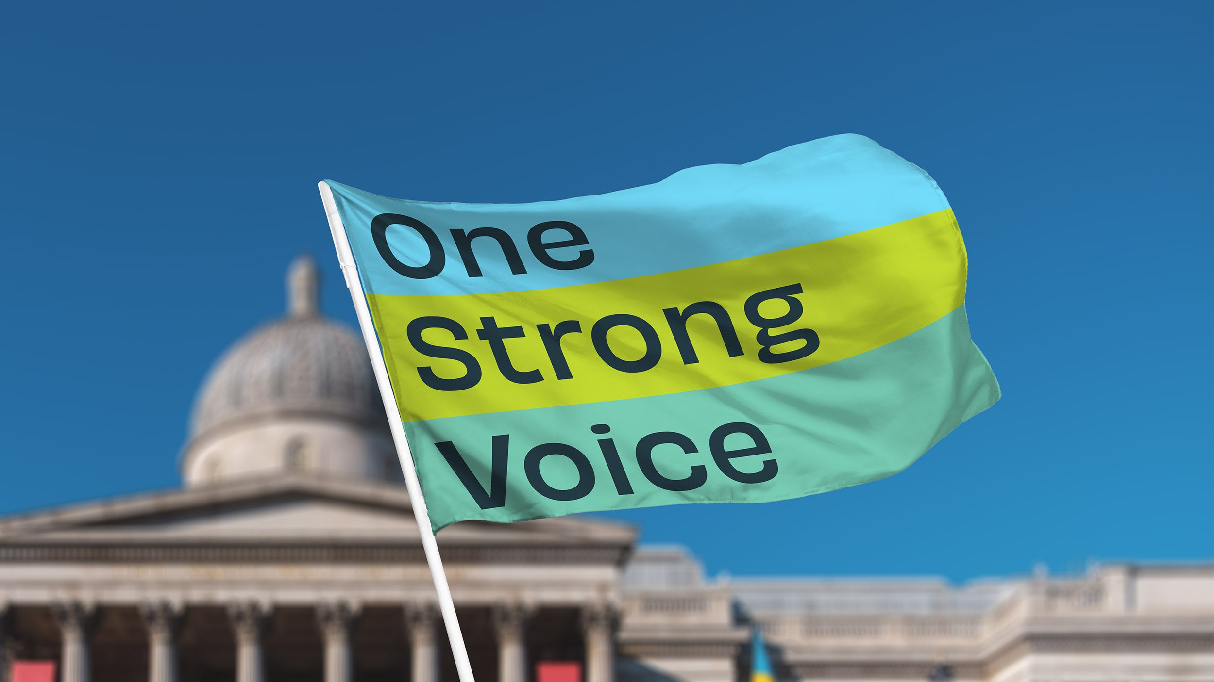
The logo is built around a horizontal grid of 27 individual sections allowing, in the first instance, for three evenly spaced rows. Across the wider identity, this principle is used as a layout device where the rows can shrink or grow proportionally within the grid to fit different types of content. Rows act as vessels for text, images or remain blank to break-up content within their respective layouts. Other important concepts like amplified voices and facilitating meaningful discussions are brought into the identity through speech-bubble-like containers, as well as a megaphone-esque type treatment.
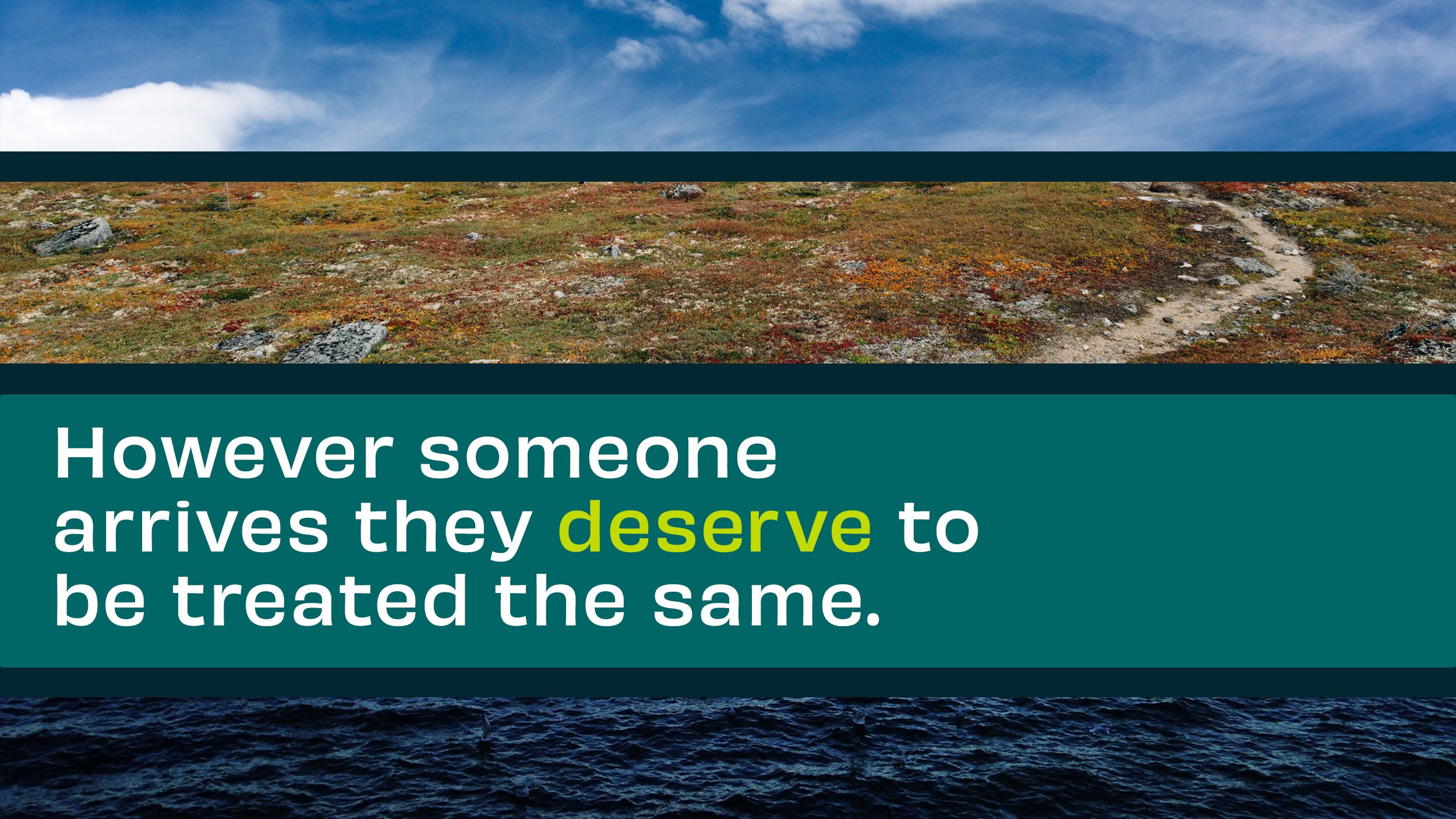
The colours used throughout the identity are derived from land, sea and air, a link to another of One Strong Voice’s central tenants – that however someone arrives into the UK, they should be treated the same – that is, with fairness, humanity and compassion.

